Many smartphone users have recently noticed significant changes in their phone app interface and contact list. Google rolled out a major update to its Phone app, introducing a sleek new design and improved functionality. The overhaul brings swipe gestures and unified tabs, creating a smoother and more intuitive user experience. If you found your phone’s appearance and contact navigation suddenly different, you’re not alone—this update has rolled out to millions of devices globally.
What’s New in the Google Phone App Update?
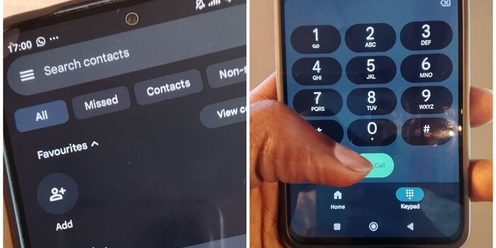
Google’s redesign introduces convenient swipe gestures for quicker navigation between calls, contacts, and voicemail. The new unified tabs place all essential features at your fingertips, reducing the time you spend searching for contacts or recent calls. These enhancements aim to make communication faster and more seamless. Users can now expect a cleaner layout and easier access to key functions, making everyday tasks much simpler.
Why Did Google Make These Changes?
Google regularly updates its apps to enhance usability and match evolving user needs. Feedback from the Android community played a major role in shaping these upgrades. If you’re still adjusting, take some time to explore the new design—most users find it more efficient after a short learning curve. This update is part of Google’s ongoing commitment to delivering the best possible user experience across its ecosystem.
Sources:
Google Launches Phone App Overhaul